 ❌❌
✅.navbar-expand
❌❌
✅.navbar-expand
 ❌❌
✅It maintains a fixed aspect ratio for the media and resizes it with the content. (Nejdelší)
❌❌
✅It maintains a fixed aspect ratio for the media and resizes it with the content. (Nejdelší)
 ✅✅
✅✅
 ✅✅
✅✅
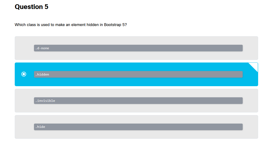 ❌❌
✅.d-none → neboli display none
❌❌
✅.d-none → neboli display none
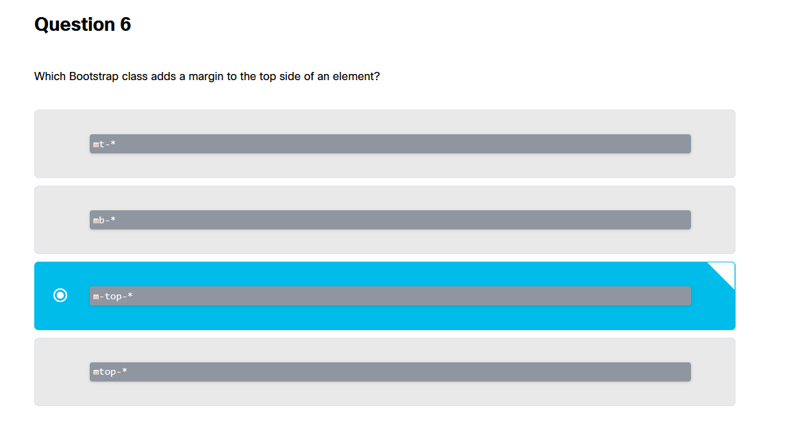 ❌❌
✅mt-* bootstrap je “líný” na text
❌❌
✅mt-* bootstrap je “líný” na text
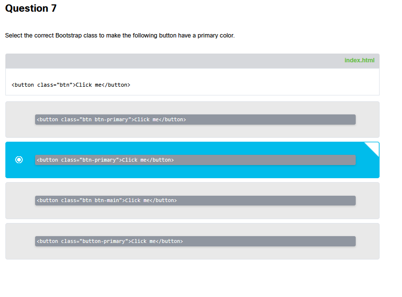 ❌❌
✅btn btn-primary
❌❌
✅btn btn-primary
 ✅✅ nejdelší
 ✅✅
✅✅
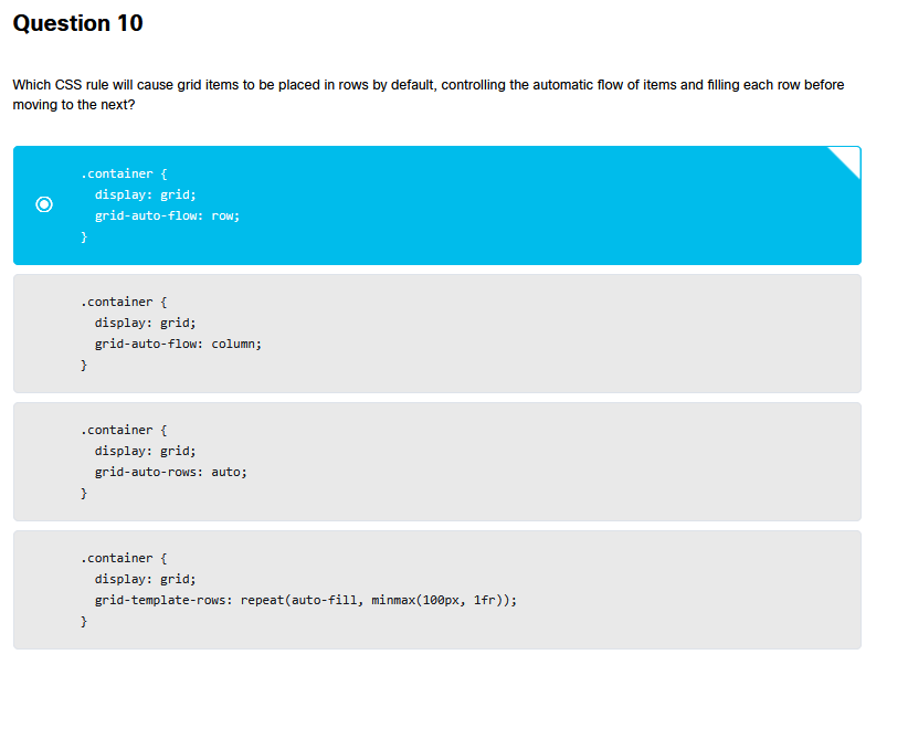 ✅✅ grid-auto-flow row
 ❌❌
✅align-items: center
❌❌
✅align-items: center
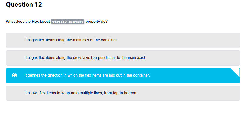 ❌❌
✅It aligns flex items along the MAIN axis of the container.
❌❌
✅It aligns flex items along the MAIN axis of the container.
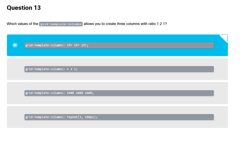 ✅✅ 1fr 2fr 1fr
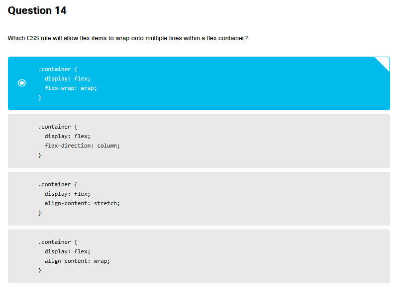 ✅✅ flex wrap wrap
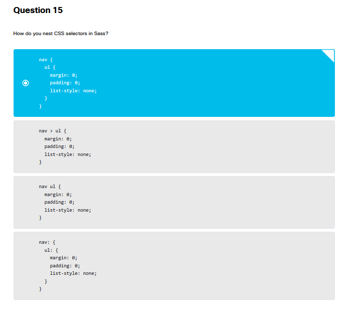 ✅✅ nav{ ul {}}
 ✅✅ nejdelší
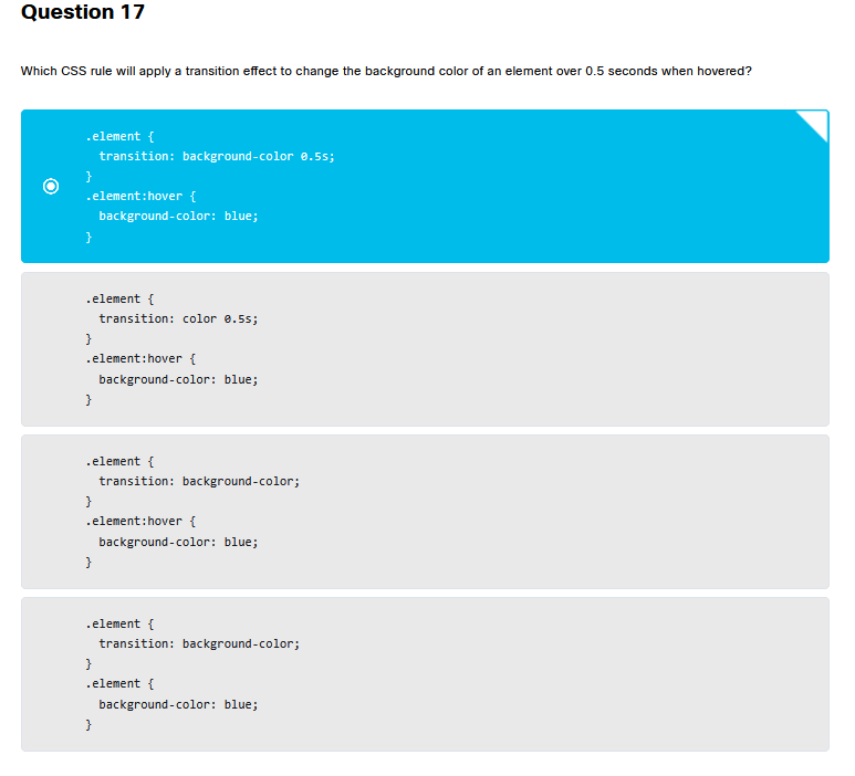 ✅✅ transition: background color 0.5s
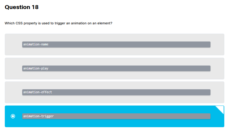 ❌❌
✅ animation-name
❌❌
✅ animation-name
 ✅✅ nejdelší
 ✅✅organizace je bestest
 ✅✅ nejdelší*
 ✅✅ nejdelší a hlavně prohlížeč je hloupý
 ✅✅ nejdelší
 ✅✅nejdelší
 ✅✅ nejdelší rem
 ✅✅ up right down left
 ❌❌
✅use BEM
❌❌
✅use BEM
 ❌❌
✅minimize the use of universal selectors
❌❌
✅minimize the use of universal selectors
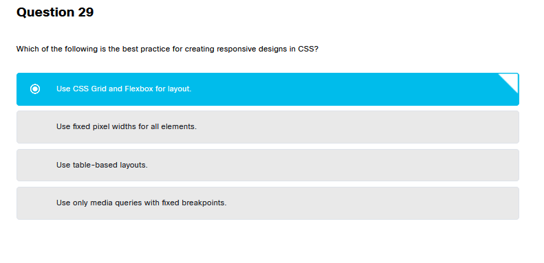 ✅✅ Grid und flexbox
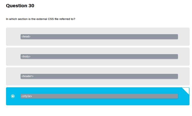 ❌❌
✅ EXTERNAL Odkazy patří do head
❌❌
✅ EXTERNAL Odkazy patří do head
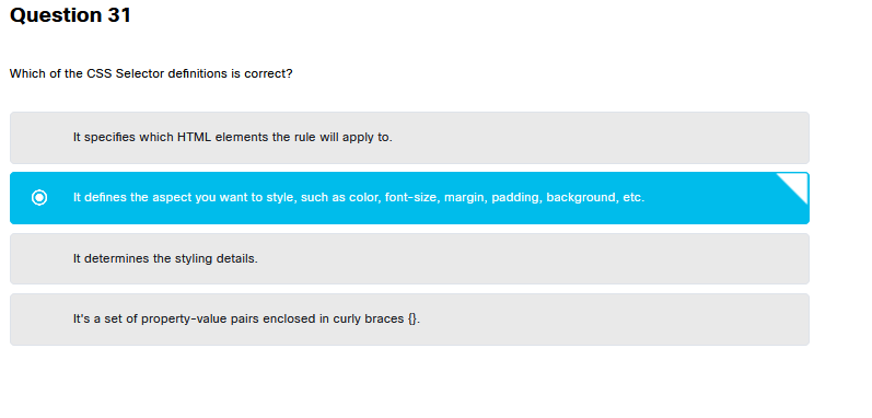 ❌❌
✅ it specifies which HTML elements the rule will apply to.
❌❌
✅ it specifies which HTML elements the rule will apply to.
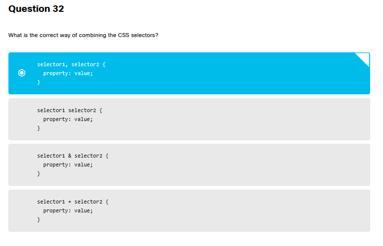 ✅✅Čárka (
,) v CSS znamená “A TAKY”
 ✅✅ selektivní výběr ale i to nejlogičtější…
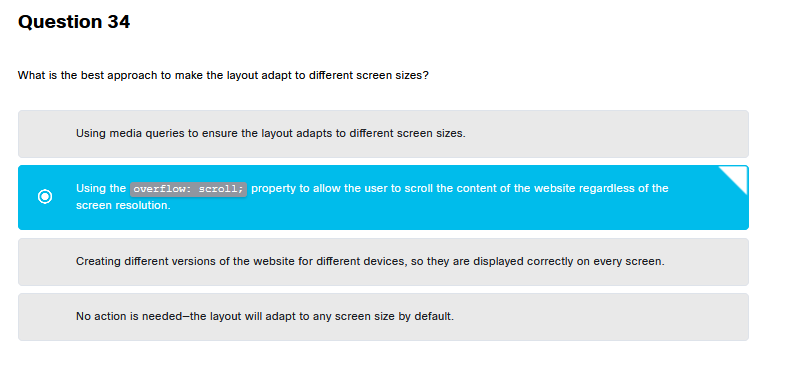 ❌❌
✅Using media queries to ensure the layout adapts to different screen sizes.
❌❌
✅Using media queries to ensure the layout adapts to different screen sizes.
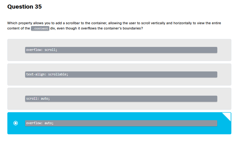 ✅✅ overflow auto moto traktůrek filip… selektivní logický výběr
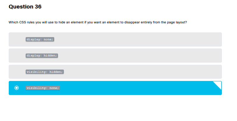 ❌❌
✅visibility none NEEXISTUJE správně je display none
❌❌
✅visibility none NEEXISTUJE správně je display none
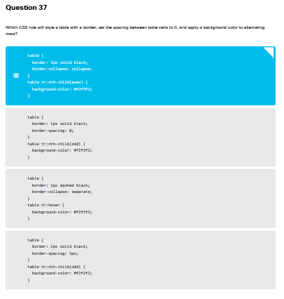 ✅✅ Border collapse - collapse
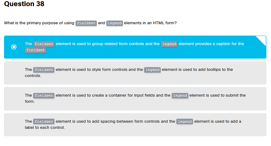 ✅✅ fieldset legend fieldset
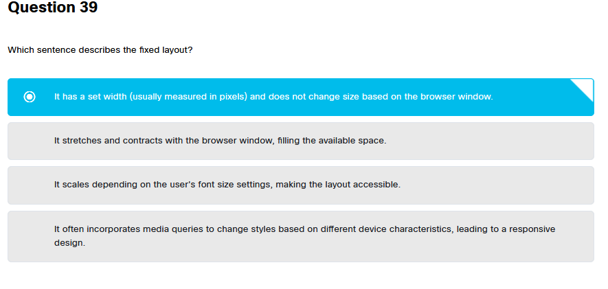 ✅✅ set width
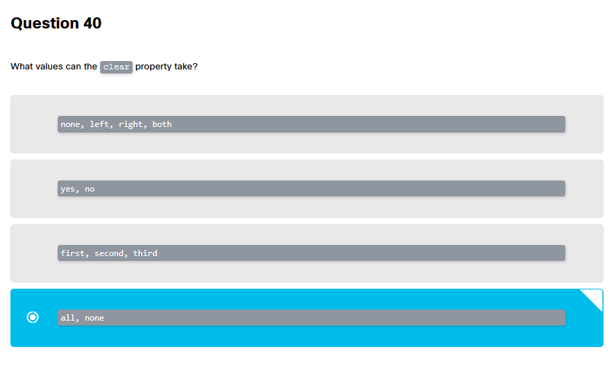 ❌❌
✅ none left right both … prostě všechny směry na světě…
❌❌
✅ none left right both … prostě všechny směry na světě…
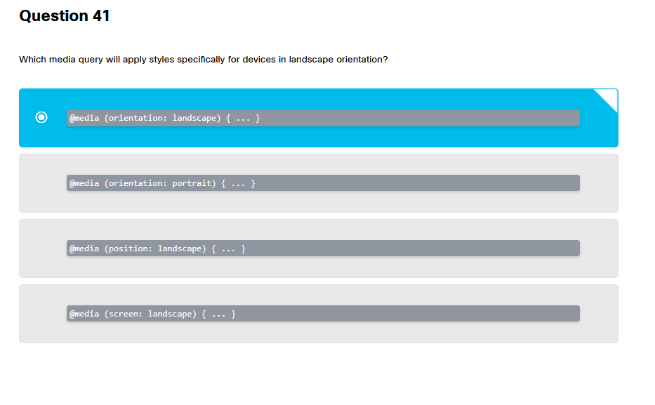 ✅✅ orientation landscape
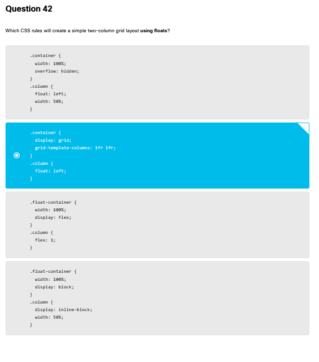 ❌❌
✅ overflow hidden
❌❌
✅ overflow hidden
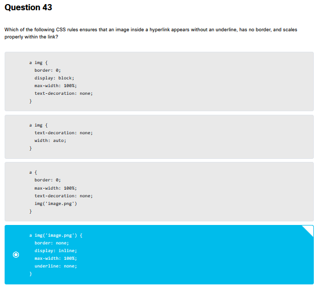 ❌❌
✅a img{hodně textu} bez odkazu na obrázek
❌❌
✅a img{hodně textu} bez odkazu na obrázek
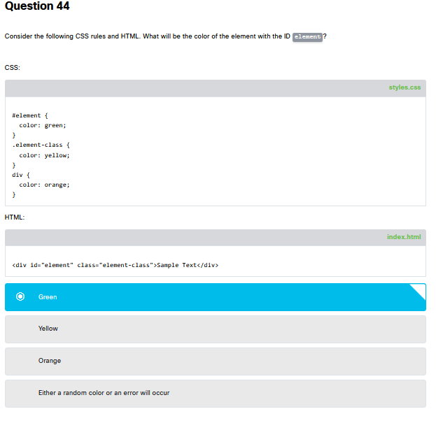 ✅✅green podle ukazatele váhové třídy
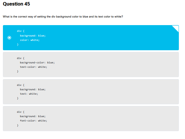 ✅✅ background a color
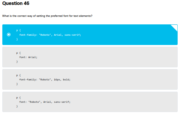 ✅✅ nejdelší a font family…
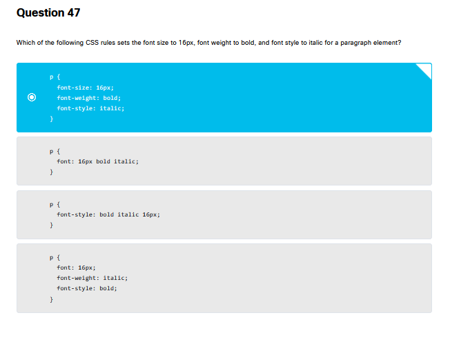 ✅✅ vždycky font- font- font-
 ✅✅
✅✅
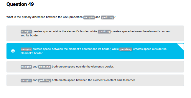 ❌❌
✅MARGIN creates space OUTSIDE the element’s border, while PADDING creates spaces between
❌❌
✅MARGIN creates space OUTSIDE the element’s border, while PADDING creates spaces between
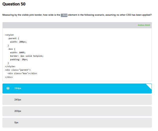 ✅✅ math is mathing